
Because it is so new, people often struggle with figuring out how Data Generative AI (D-GAI) can be integrated into their business. I recently wrote about what technical requirements you’ll need for automated reporting, but that’s only half of the equation. Assuming you’ve got a good use case for automated content, you still usually need to sell that use case within your organization. This conversation is typically driven by someone with a visionary mindset that is able to peer into the future to see how D-GAI can provide value. I’ve been very fortunate to work with a lot of forward-thinking people who have made big D-GAI projects happen.
On the flip side of the visionaries are the skeptics. They serve a valuable role too, of course, by making sure new projects pencil out for their organization. Those folks tend to want to take a baby step first, leading us into the tricky waters of building an MVP- Minimal Viable Product.
For the reasons I will lay out in this article, setting up a ‘test’ product, or a simplified version of automated content, can be quite difficult. While the first part of this article is going to focus on those difficulties, don’t worry- there ARE solutions to all of the problems I lay out. After reading this, you’ll have a guide showing exactly what speed bumps you are likely to encounter as you try to sell automated reporting internally, and how you can navigate around them.
An Automated MVP

The fundamental problem with building out an automated content MVP is that the process of building it is a very front-loaded affair. The vast majority of the work involved is in the setup, with much less work needed after it is off and running. In fact, manufacturing reports at scale shares a lot of similarities with manufacturing a physical product at scale.
Think about what goes into setting up a factory for mass production. First, you have to prepare a building site and secure access to raw materials. Then, you have to construct the building and set up the production line. Finally, you have to set up a distribution channel for the products you create.
The process infoSentience follows for building new automated content follows a similar three-step process. First, we need to connect to your company’s data. This will give our reporting system the raw material it needs to tell the stories. Next, we need to build out all the specific intelligence that’s required to really tell the story of your data. Just like setting up a production line, this is usually the most complicated part of the process. Finally, we need to set up some system to distribute the automatically written content to the end users.
All of this takes quite a bit of up-front time and expense. To build all of this out for a test period of content delivery would be like building an entire car factory just to build a few prototype cars. It’s simply too much of an investment to undertake up front to pencil out.
The Too-Minimal-To-Be-Viable Product
When faced with this dilemma, a response that I often hear from potential clients is something like: “let’s just do a simple version of the product”. While I understand their thought process when they make this suggestion, it isn’t a viable way to sell the solution internally. The problem with creating simplified versions of the final reports is that it will likely end up being a “Mad-Libs” style solution, in which a template is set up and filled in with data. I wrote an entire article about why these reports don’t work, but the basic problem is that the narratives are always reporting on the same basic things, so they don’t really provide any insight (and are often just plain boring). Internal skeptics viewing examples of these reports will quickly realize that either: (1) the reports are so simple that they are not very valuable, or (2) such simple reports could pretty easily be created internally if they really want them.
Going back to our car factory example, it would be like trying to sell somebody on the idea of building a luxury car by first building a small factory that produced a simple economy car. At that point, the buyer is going to need to make a ‘leap’ to understand how to go from the economy car that has been built to the luxury car that would be the final delivery.
Since we always show potential clients interactive examples of our best work, the creation of a simplified MVP merely changes the kind of ‘leap’ that they will need to make. After showing them a demo of our best work, internal skeptics need to go from:
- Quality content with external data (the demo) 🡪 Quality content with my data
After building a simplified MVP they need to go from:
- Simplified content using my data (the MVP) 🡪 Quality content with my data
Personally, I think the second leap is actually more difficult, and so creating a simplified version of a final product can actually set us back in selling the product internally.
Three Solutions

Human-Written Examples + Trust
I mentioned previously that nobody builds a factory just to produce a few prototypes. The good news is that we don’t have to build a factory to build a prototype. Just like in the automobile industry, we can hand build a prototype for review. In the D-GAI space, this involves getting a representative sample of your data, determining exactly the kinds of narratives we can automatically build, and then hand-writing examples for your review. We can then easily iterate with clients to ensure the narratives look exactly how they want them.
Building a manually written narrative isn’t enough by itself, however. You have to have faith that the prototype narratives can be turned into automated reports that look just like the prototype. This is where having a long history of producing quality content comes into play. At infoSentience, for instance, we’ve been creating automated content for more than 10 years, so we know exactly what’s possible when looking at a data set.
Rev-Share/Bounty Models
Instead of having to sell the higher-ups at your organization on the value proposition of automated reporting, you may be able to set up a revenue-sharing or bounty-based contract. This has the effect of outsourcing the value question to us. We have to make a determination if the final product will likely make back the costs of development, and if so, we choose to go forward. This arrangement also incentivizes us to make continual improvements to increase the value of the contract.
Finally, this structure often makes it simple to expand the original product, as the initial rev-share model can apply to the new content. Essentially, your automated content provider is just turning on a money faucet, and the only question is how much more money is going to come out.
You’re a Giant
If the value of the automated content is significant enough, it may be the case that a ‘trial’ run is more than enough to cover the costs of setting up the product. Even a three-month trial period might be sufficient in certain cases. In this situation, the MVP is the full product, and you therefore don’t need to worry about making a long-term commitment up front. This is even more likely to be the case if the content itself requires less work to set up.
In Conclusion
Ultimately, any new business decision is going to require seeing into the future and making your best assessment of how to proceed. When that future assessment involves working with a new vendor and utilizing a new type of technology, looking into that vendor’s past is often the best guide. In infoSentience’s case, we’ve had a 10+ year history of building great products for leading companies in several verticals. When you combine that experience with the MVP alternatives laid out in this article, you should have confidence in moving forward with automating your reporting and content generation.

Why You Should Use Intelligent Reporting and Skip the Templates
When it comes to creating automated content, using a heavily templated approach is very enticing. It allows you to quickly set up new content and make sure that the final narratives very closely follow the outline that you set up. I call this a ‘Mad Libs’ approach, since it follows the same basic structure of the kids game, where the blank words in templates are filled in with specific details. Many companies in the Natural Language Generation space have made use of this approach, often thinly papering over their templates by adding a few basic options or paraphrases.
Having watched this industry for over ten years, I’ve seen how a huge percentage of these projects (and the companies connected to them) have failed. So often, it is because template-based approaches have hidden problems that are not apparent to non-experts at first glance.
Before diving into those hidden problems, let’s first establish the alternative to templates- intelligent narratives. Rather than using templates, these narratives are built by: (1) going through data to figure out what the most interesting stories are, and then (2) allowing the most interesting stories to self-assemble into a well-structured narrative. This has the huge advantage of ensuring that all the most compelling content finds its way into the final narrative. While templates wedge the data into the narrative, intelligent reporting builds the narrative around the data.
Sounds way better, right? But then why do some companies try the templated approach? That’s where template’s ‘hidden’ problems come into play. When comparing a single templated report with an intelligent narrative, the template will often not look that much different. In particular, the templated report will seem to do a good job hitting on the ‘main’ points (what was up, down, etc.).
The real problems happen over time, as people read more versions of the templated content and realize they are all fundamentally the same. This causes readers to (1) worry that they aren’t getting the full story, and (2) get tired of having to read through words just to get to the same pieces of data.
Narratives Are Not Predictable

If you have a big data set, the number of possible interesting stories you could write about that data is nearly endless. Which stories will wind up being the most interesting (the ones you will include in your narrative) cannot possibly be known in advance.
Take a football game, for example. Sure, the final score and the teams’ records are pretty much always going to be relevant, but beyond that, it’s chaos. You might have a game where there was a huge comeback, so the flow of scoring over the course of time is the key story. In another game, it was a blowout from the start and the key story is about a player’s stellar statistics. Or, the key story could be the revenge factor a team has after having been eliminated from the playoffs by their opponent in the previous year. I could go on, but you get the point- there is no way to write a template for all these possibilities.
Essentially, templates have to be built to talk about the types of things that always occur. One team wins; one team loses; the winning team’s record is now X; the losing team’s record is now Y; etc. However, it’s the things that rarely happen that are actually the most interesting to the reader. This goes for sports, sales figures, stock movements, you name it. Templates are therefore ironically built to show the exact information that is the least compelling to the reader.
There's A Reason We Don't Like 'Robotic' Writing

On top of doubting that they are getting ‘the real story’, readers having to repeatedly slog through the same information in the same arrangement over and over again will soon be begging to just see the data! This is because the words in a templated report are not actually adding any real information compared to the way they are in a flexible, intelligent narrative.
The idea that words are the key to helping people understand information stems from a fundamental misunderstanding of where the power of narratives comes from. There are two main advantages of a narrative when compared to raw numbers: (1) the ability to include or exclude certain information, and (2) the ability to arrange that information into main points, counter-points, and context. Wrapping words around the exact same set of data points in every report will not realize either of these advantages.
Fundamentally, good reporting is about synthesis, not language. In fact, intelligent reports can use very little language (as in infographics) and still convey a great deal of easy-to-digest information. Without intelligent synthesis, you are better off just giving readers the key pieces of data and letting them piece together the stories themselves.
[Quick note: both this problem and the problem of missing key information are most applicable to situations where end users are reading multiple reports. It is possible you could have a use case where people are only going to read the templated report once. In my experience, however, that circumstance is rare due to the amount of work that needs to be done to set up automated reporting. You typically have to merge your data into the automated reporting system, set up the reports (which take a decent amount of time even if you are using a template), and then set up a distribution system. It’s rare for this procedure to pencil out in use cases that don’t involve readers encountering multiple reports, either because they are getting multiple reports over time (e.g. a weekly recap) or seeing reports on different subjects (e.g. reports on different sales team members).]
Starting Over Next Time
Given the large initial investment in data integration, companies are often interested in applying their automated reporting capability to new, related use cases. In this very likely circumstance, you are much better off having built out your content with flexible intelligence rather than templates. Let’s examine why that is by looking at two different scenarios.
In Scenario #1, you’ve invested in building out an intelligent Generative AI system that synthesizes your data and turns it into compelling, insightful reports. In Scenario #2, you took a shortcut and built out a template-based reporting system. The good news is that in both scenarios you will be able to quickly adapt your narrative generation technology to your new use case.
The bad news, if you are in Scenario #2, is that your new reporting will have all the drawbacks that are inherent to a Mad Libs approach, since you will simply be building a brand new template from scratch. If you built an intelligent system, however, you would be able to apply the already-built intelligent components to the new use case. This reshuffling typically takes the same amount of time that it would take to build a template. Essentially, by building intelligence instead of templates, you can quickly expand quality content at the same rate that you can expand cookie-cutter templates.
In Conclusion
Investing in quality content is going to cost more than a templated approach, and the benefits will not be obvious at the beginning. Over time, however, templates provide little to no value, while intelligent reporting will prove its worth. Trust me on this one: leave the Mad Libs to the kids.

Ok, first things first- pivot tables most certainly DO WORK…at some things. This article is not about why pivot tables are useless, but rather about the ways that pivot tables fall short of solving the data analysis needs for many companies and use cases. I also explain the fundamental reasons WHY they fall short. I focus on pivot tables because they are probably the best tools that currently exist for most companies to run data analysis. If pivot tables can’t help you with your data analysis, then it’s probably the case that no software tools can (that you know of 😉).
How Pivot Tables Can Help
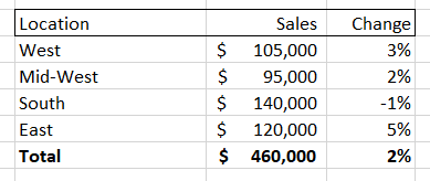
Pivot tables are great at quickly surfacing the most important top-line numbers in your data. Let’s use, as an example, a retail company that has a record of every single sale they've made. They could store each sale as a row in a spreadsheet, showing the date of the sale, price, location, and a product class.
If the company had a large number of sales then the spreadsheet would quickly get unwieldy. Summing up the total sales could be helpful, but what if you wanted to dive into a particular aspect of this sales data? A pivot table gives you that ability, allowing you to, for instance, isolate sales for a given month and then break down those sales by location. It might look something like this:
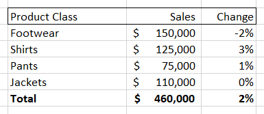
You could also choose to break down the sales numbers by product class, giving you something like this:
Pivot tables also allow you to change time periods, add new columns (like net profit, discount percent, etc.) and also easily turn these tables into charts and graphs. However, while a pivot table allows you to very easily see and visualize numbers, it only allows you to see that information along the dimension of your pivot table. So, if you are looking at the ‘location’ breakdown you can see the changes along that dimension. Same for the ‘product class’ breakdown.
But what if the interesting information that you need is at the intersection of two different dimensions? For example, both the “Midwest” and “Shirts” could individually have the numbers shown above, while sales of “Shirts in the Midwest” are down significantly. You would not be able to see this by looking at either of these pivot tables.
A quick-witted data analyst at this point will point to a flaw in my complaint- if the interesting movements in my example data are located at the intersection of the ‘location’ and ‘product class’ data, then a user could select both of those dimensions to create a new, more detailed pivot table. Something that looks like this:
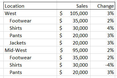
But there are two problems with this solution. First, you have to proactively find the right set of intersections. As we will soon see, the number of possible combinations for most data sets is gigantic, so it may be difficult to find the key information if you don’t have significant time and/or expertise. Second, as you increase the amount of information in your pivot tables it becomes harder to actually digest it. In the examples above, we went from a very easy-to-read set of four items plus a total value, to a much harder to digest set of 16 sub-items, 4 items, and a total value. This could easily get out of control if we added a third dimension, and that’s before adding more metrics or KPIs as columns and/or having larger numbers of sub-components for each dimension.
It's More than Just Subjects
Hopefully you have a sense of how difficult it can be for pivot tables to deal with all the different ways that subjects and groups can be broken down. Unfortunately, that is only one small problem in the world of data analysis. There are five big dimensions to data analysis. Critically, each of these components is independent of each other, meaning that pivot tables, which start to get unwieldy when handling three dimensions of interaction, are utterly hopeless in helping users to understand interesting aspects of their data that might involve seven or more dimensions of interaction. The five main classes of dimensions (which each can contain many sub-dimensions) are:
Subject Groupings
The retail grouping example I used above is really an aspect of two different dimensions of analysis – parent grouping and children grouping. When examining data from a parent group perspective we look to see how it compares to other subjects in the same group (e.g. Midwest vs. East) or compare data to the average among all siblings (e.g. Midwest vs. All Locations). When looking at children groupings, we are looking to see which sub-components are driving the overall figures. As noted in our pivot table example above, this might involve diving into multiple dimensions (e.g. 'location' + 'product class') to determine the most relevant subject.
Timing
There are different ways to create data points using time periods (sales for the day, week, month, etc.). There are also different ways to contextualize data over time periods: we might look at how a metric has changed over time, whether it has trended up or down over a certain time period, or how it compares MTD to a similar period in the past. Both the way we create data and the way we compare it are independent dimensions (e.g. you can look at how data from this month [data creation period] compares to data from the same month last year [data comparison period]).
Metrics
These are the actual figures you care about in your data, such as ‘total dollar sales’, ‘units’, ‘average price’, etc. There is some conceptual similarity between dealing with a group of metrics and dealing with a group of subjects. The key difference is that groups of subjects combine to form their parent (such as the sales for all ‘locations’ adding up to the total sales) whereas metrics are different aspects of the same subject. Pivot tables do a reasonably good job of handling this dimension, as you can typically express different metrics using columns instead of rows. Adding more than a few columns, however, can quickly overwhelm the end user, which is a problem because end users often have a large number of metrics that they potentially care about. The use of metrics is also complicated by the fact that many metrics have different aspects that function like new dimensions of analysis. For instance, you might have a total sales figure, but then there is also the change of that figure over time.
Events
These are the different types of ‘stories’ contained within your data that end users are concerned with. Stories like ‘X metric is trending up’ or ‘Y metric is now above 0 for the first time since Z date.’ Most end users have a list of hundreds of events they care about. Pivot tables typically do not even make an attempt to handle this aspect of analysis, leaving it up to the user to deduce these events from looking at the numbers.
Importance
This dimension tries to break down data by what is actually the most valuable to the end user, which requires it to sit at the intersection of all the above dimensions. It needs to weigh the inherent interest level of a particular subject, each metric of that subject, each possible time period to analyze that metric over, and each event that metric could be involved in. On top of that, this dimension incorporates other elements, such as the volume of a given subject (compared to its sibling metrics) and whether a particular event is relevant given previous reporting.
Just how crazy difficult it is to navigate each of these dimensions while running data analysis is obscured by the brilliant human brain. Humans have the ability to map layers of meaning on top of each other and simultaneously calculate across multiple dimensions of analysis. We can then synthesize the most important information found at the intersection of all the dimensions listed above- either creating a narrative, giving a presentation, or creating a set of key charts and tables. Unfortunately, this process for human beings requires expertise and intuition as they wander down pathways in the data to find those nuggets of information. It also takes a great deal of time, costs a lot of money, and can never be as thorough as a computer. Pivot tables are really just a partial shortcut- allowing data analysts to skip a couple of dimensions of analysis but still requiring them to brute-force the rest.
Time to Pivot from Pivot Tables

What if a computer could handle this task? You would then get the best of both worlds. Like a human being, it could flexibly run through multiple, independent dimensions of analysis and then synthesize its findings in a way that was easy to understand. Being a computer, it could also analyze information much more thoroughly, run its analysis very quickly, and be able to produce reports at incredible scale. infoSentience has actually created technology that can accomplish this. In brief, the key technology breakthrough is to (1) use conceptual automata designed to run an analysis for a particular dimension, (2) allow each automata to run independently, and (3) give them the intelligence to interact with the other conceptual automata so that they can come together to form a narrative. Keep following this space for more information on just how far reaching this breakthrough will be.

infoSentience's automated content today is the worst you will ever see it. That will be true if you are reading this article on the day I published it, and will also be true if you are reading it a year later. Why is that? Simple- every day, our content is doing one of two things: (1) staying the same, or (2) getting better. The ‘staying the same’ part is pretty straightforward, as our software will never get tired, make mistakes, need retraining, decide to change jobs, etc. On the other hand, we are constantly making improvements, and each of those improvements establishes a new ‘floor’ that will only get better. I call this the ‘improvement ratchet’ since it only moves in one direction- up! There are three key ways that automated content gets better over time:
- Improving Writing Quality
- Expanding the Content
- Better Audience Targeting
Improving Writing Quality
The most straightforward way that our automated content improves is by teaching our software how to write better for any particular use case. One way we learn is through feedback from our clients, as they see the written results and suggest changes or additional storylines. Another set of improvements comes from the iterative dance between the system output and our narrative engineers. When you give software the freedom and intelligence to mix content in new ways you sometimes come across a combination of information that you didn’t fully anticipate. For example, let’s look at this paragraph:
Syracuse has dominated St. Johns (winning 13 out of the last 17 contests) but we’ll soon see if history repeats itself. Syracuse and St. Johns will face off at Key Arena this Sunday at 7:00pm EST. St. Johns has had the upper hand against Syracuse recently, having won their last three games against the Orange.
This paragraph works reasonably well, but the specific combination of the first and third stories aren’t tied together as well as they could be. In this case, the final sentence (about St. Johns dominating recently) would be improved by incorporating the information from the first sentence (about Syracuse having a big advantage overall). The updated version of the last sentence would read like this:
Despite Syracuse’s dominance overall, St. Johns has had the upper hand recently, having won their last three games against the Orange.
This improvement is an example of what we call an ‘Easter Egg’, where we add written intelligence that is targeted to an idiosyncratic combination of events. Our reports contain hundreds of possible events adding up to millions of possibilities. Adding intelligence to these events allows them to combine together properly and avoid repetition. However, there’s no way to build out specific language for all possible interesting combinations in advance. As we read actual examples we come across unique, interesting combinations. We can then add specific writer intelligence that covers these combinations to really make the reporting ‘pop’.
Critically, this intelligence is usually a bit broader than just a simple phrase that appears in only one exact combination of events. In the example above, for instance, we would add intelligence that looks for the contrast between a team’s overall record against an opponent and their recent record and allow that intelligence to work in any such situation. We also need to make good use of our repetition system to make sure that all these Easter Eggs don’t start tripping over themselves by repeating information that was already referenced in the article.

Expanding the Content
Another way that content improves is by quickly expanding into similar use cases. For example, when we started with CBS we only provided weekly recaps for their fantasy baseball and football players. We soon expanded to offering more fantasy content: weekly previews, draft reports, year-end recaps, and more. Because those were successful, they then asked us to provide previews and recaps of real-life football and basketball games. We quickly added soccer, and then expanded the range of content by also providing gambling-focused articles for each of those games.
This same story has played out with many of our other clients. One of the big reasons for this is because automated content is so new that it’s often difficult to grasp just how many use cases it has. After seeing it in action, it’s much easier to imagine how it can help with new reporting tasks.
The other big reason that automated content often quickly expands is because the subsequent use cases are often cheaper to roll out due to economies of scale. There are three main steps to generating automated content:
- Gather data
- Create the content
- Deliver it
Each of these steps is usually much easier when rolling out follow-up content. In the case of Step #1, gathering data, it is sometimes the case that literally the exact same data can be used to generate new content. This happened when we expanded from general previews to gambling-focused previews for live sports games, which just emphasized different aspects of the data we were already pulling from CBS. Even if there are additional data streams to set up, it’s usually the case that we can still make use of the original data downloads as well, which typically reduces the amount of set up that needs to take place.
When it comes to Step #2, creating the content, infoSentience’s ‘concept based’ approach pays big dividends. Instead of creating Mad-Lib style templates, infoSentience imparts actual intelligence into its system. That allows the system to be flexible in how it identifies and writes about the most important information in a data set. It also means that it can quickly pivot with regard to things like: the subjects it writes about, the time periods it covers, the length of the articles, the way it adds visualizations, the format of the report, the importance of certain metrics and storylines, and many more. Entire new pieces of content can often be created just by turning an internal ‘dial’ to a new setting.
Finally, for Step #3, there is usually a tremendous amount of overlap when it comes to the delivery process for follow-up content. Typically, we will coordinate closely with our clients to set up an initial system for delivery. This might entail dropping our content into an API ‘box’ that our clients then access, but other times we send out emails ourselves or set up a web site to host the content. We might also set up a timing system to deliver content on demand or at particular intervals. It is often the case that these exact same procedures can be used for follow-up content.
A great example of how all these steps came together is when we expanded to providing soccer content for CBS. In that case, the data pulldown and delivery procedures were identical, requiring no changes at all from CBS. While we did create some soccer-specific content, much of the sports intelligence for soccer was able to make use of the existing sports intelligence we had built into the system.

Better Audience Targeting
Finally, another way that automated content improves is from user feedback. Automated content allows for a level of A/B testing that would be impossible using any other method. I’ve already mentioned that our AI can change what it focuses on, its time periods, length, format, and more. It can also use different phrase options when talking about the same information, and even change the ‘tone’ that it uses. All of these options can be randomized (within bounds) when delivering content on a mass scale. It is a simple task to then cross-check user engagement with each of these variables to determine what the optimal settings are.
It's also possible to allow individual readers to customize their content however they want it. All of the ‘options’ mentioned above can be exposed to end users, allowing them to specify exactly what they want to see. This not only allows users themselves to improve the content they see, but also gives organizations a better understanding of the information that each of their customers really care about.
Conclusion
So much of our time in business and life is spent in a losing fight against entropy. Automated content provides a welcome break from that struggle. Set it up and enjoy great benefits from day one, knowing that the only changes that will ever take place are for the better.

[This post is the 2nd in a series of technical-focused articles exploring the challenges of using conceptual thinking to create written data analysis.]
Time is of the essence. This is true if you are in a hurry, but it’s also true if you are doing data analysis. Individual data values are almost always contextualized by looking at time-related events such as how much they have moved up or down, whether they are part of a trend, how high/low they are compared to past values, etc. Fortunately for human beings, manipulating time is something that comes easy to us. For example, if you know how to put together a monthly written report on a given topic, it would probably be quite obvious how to put together a weekly version of the same report.
For computers, however, this is not so easy, because they don’t think conceptually. Sure, software systems like Power BI and Tableau can show you the correct numbers for any given time period, but they don’t have the sophistication to think about any given time period, and this prevents them from giving you a time-flexible written synopsis.. Sophisticated, conceptual thinking is required because there are many (often subtle) difficulties when calculating and writing about time. In this post, I’m going to walk through some of those difficulties, and also show how a Conceptual Automata System (CAS) has the ability to navigate those difficulties.
Challenge #1 - What time periods are relevant?
Before trying to figure out how to manipulate time periods, a CAS needs to understand what time periods would even be relevant to a reader. For instance, an HR coordinator might be interested in a yearly high/low for a given metric, whereas a stock trader might be interested in the (slightly different) 52-week high/lows. A manufacturing VP, on the other hand, might care most about quarterly numbers, and so that would be set up as the default time period for their report. The best time period to contextualize information will almost always vary by use case. .
Furthermore, the CAS has to take into account whether certain time periods are relevant to certain analytical events, such as streaks or outlier changes. For example, it might be interesting to note that a stock’s increase for the day was the highest in six months. It would not make sense to note that same story for a quarterly time period, since that might only represent two periods. That said, it would be equally invalid to require a 180 period gap between noting outlier quarterly events. Therefore, you need to have a sliding scale that allows longer time periods to need fewer intervals between outlier events. Many other stories would need similar intelligence to customize their thresholds based on the time period (and use case).

Challenge #2 - What to compare to?
One of the most complicated time-related issues is determining what comparison to make when calculating how much a metric has changed. In the simplest situation, you have a metric (let’s say it’s a monthly figure) and you would compare it to the previous month. But let’s say you have a very seasonal metric- in that case you might want to compare it to the same month of the previous year.
This requires adding additional intelligence to each of your time-based ‘event’ stories. For instance, if you have a story about a metric increasing, that story cannot simply look to the previous item, but rather needs to seek guidance from its parent object to figure out what to compare it to. You also need to impart intelligence to stories such as trends or streaks to make sure they also are running year-over-year comparisons. Of course, all these changes also require alterations to how you would write about or visualize the stories.
Challenge #3 - Pure time periods versus current time periods
If, on September 15th, somebody tells you that a given metric is ‘down for the month’, what exactly does that mean? It could either mean that the metric is down through the first 15 days of the month, or it could mean that it has been down since August 15th. Both forms of measurement have applications, and often different use cases will favor one or the other. Stock traders, for instance, would likely care much more about the change over the previous 30 days, whereas a manufacturer might care more about how the current month has been trending. To be truly flexible, a CAS needs to be able to handle both these use cases, or even switch between both of them within the same report.
Challenge #4 - Aggregated vs. simple time periods
There are two different ways that smaller time periods can relate to larger time periods—as waypoints or as components. Compare a month’s worth of stock data versus a month’s worth of retail data. To answer the question ‘how did Apple stock change this month’ we would compare the first day of the month to the last day of the month. If we were asking the same question of a set of retail data, we would need to add all the days in the month and then compare the aggregate of all those data points to the aggregate of the previous month.
Dealing with aggregated objects is tricky because it is usually impractical to simply aggregate and sequence every possible time period in a data set, so you might start off by just creating, for example, a monthly aggregate of the overall information. But what if a user (or the CAS) wants to look at a subset of the data, such as a region in a set of retail data? The CAS must be able to generate an aggregated time object for each region. The only way to do that is to impart ‘self-assembly’ intelligence to each aggregated object, so that it knows how to take each component (such as each day of data) and merge them together to create a composite object that covers the entire time period.

Putting it all together
As complicated as some of these issues are, the real difficulty stems from the fact that each of the solutions to these problems needs to work independently. For example, let’s say you tasked the CAS with building a report on retail numbers for April 15th. The CAS would need to: (1) understand that a month-to-date report is more appropriate than a past 30 day report, (2) be able to automatically build an object composed of data from the first 15 days of April, (3) sequence that object along with all other ‘first 15 days’ objects (and their sub-components), (4) understand that the relevant comparison for this April’s partial month numbers is to the partial month of April of the previous year, and (5) be able to write and visualize the results of its analysis.
Not only must all of the time-based intelligence work well together, but you can’t limp over the finish line with a bunch of spaghetti code to make it work. This is because the ‘time’ dimension is just one of a whole series of independent dimensions that you need to get working, such as different subjects (or groups of subjects), metrics, user preferences, content length, formatting, visualizing, and others.
The good news is that once you get all of this working, you’ve unlocked the ability to quickly understand exactly what you need to know about any time period within your data. The CAS can even do things like give you a ‘last 4 days’ report when you come back from vacation. It can also use its fluidity in moving up and down time periods to easily add context to a report- contextualizing an annual report with how things have gone in the last month, for example. True flexibility over different time periods is a data analysis superpower that previously only humans had, but no longer.

Although Generative AI is making headlines every day, it is still a new concept to most people. Furthermore, Data Generative AI (DGA) is even less well known, so many of the people I talk to struggle to understand when it makes sense to make use of it. In this post, I’ll give a quick synopsis of what DGA is, then walk through some requirements you’ll need to have in order to implement it.
What is Data Generative AI?
Many people have recently become aware of the power of generative AI by looking at Chat-GPT. This is a system that has been trained using large language sets and can create written responses to written queries. DGA, in contrast, creates written reports out of large data sets. It analyzes the data, figures out what is most important/interesting and writes out its analysis in an easy-to-read narrative. In essence, Chat-GPT and other Large Language Models (LLMs) go from language 🡪 language, while DGA systems go from data 🡪 language.
In theory, this opens up all data sets to automatic AI analysis and reporting. In practice, there are technical and economic reasons that the current use of DGA can only be applied to certain kinds of data sets.
The five things you’ll need to make use of DGA are:
- Accessible Data
- Structured Data
- Complicated Input
- Complicated Output
- Significant Scale
Accessible Data
The first step that a DGA system takes when building a report is to ingest data. Since one of the main goals of using DGA is to automate reporting processes, it figures that the process of ingesting data has to be completely automatic as well. This means that you’ll need to have some way of automatically delivering your data to a DGA system. Typically, this means setting up an API with a private authentication key to allow the DGA to pull down data. However, there are other methods as well, such as sharing a flat file or giving access to an online spreadsheet such as Google Sheets or Office 365. If security is a concern, it could even be possible to build the DGA system using a sample data set and then transfer the program onto your servers so it could run without the data ever leaving your organization.
The good news is that while you might need to create a new access point for your data, you will rarely need to change the format or structure of how your data is stored. This is because all of the data coming into a DGA system needs to be manually placed into a conceptual hierarchy. This process takes the same amount of time whether you have one API with all of your information in JSON format, or 10 different data silos with a mix of formats. In fact, one of the great benefits of DGA is the ability to pull in information from anywhere and make it all understandable and accessible.
Structured Data
Accessing the data is only part of the equation, however. The other key requirement is that the critical data you want to analyze is ‘structured’ data. Determining what counts as ‘structured’ data is a bit tricky, so let’s go over an example. Here is a simple spreadsheet of stock data:
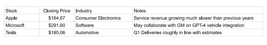
In this example, “Closing Price” is a perfectly structured piece of data. It has a clearly definable metric (Closing Price) that is represented by a number. This makes it really easy for DGA systems to work with it. Slightly less structured is the data in the “Industry” column. In this case, you have a text value that corresponds to all possible industries. Whether a variable like this would be considered structured or not typically comes down to: (1) how it will be used, and (2) how many different text options exist. If it is just as simple as having the system assign an ‘industry’ value to each company and group it with other companies that have that same industry, then this can be pretty easy. But imagine if there were 100 different industry types. In that case, you might want to assign each company a higher-level organizational value (like a ‘sector’) that comprises many industries. This might need to be set up manually as part of the data ingestion process. Furthermore, if you have many possible text values it’s likely that some of them might need spelling or grammar intelligence attached to them (such as whether they are singular or plural).
Looking at the "Name" column, we see an example of text-based information that is minimally structured for data purposes, but can be effectively used for labeling. You can’t use this text to derive substantive information about the company, but you can simply insert it into the narrative. Again, there might be complications with data like this because of grammatical issues.
Finally, we get to the ‘Notes’ column. Sentence and paragraph length text is the least structured data. Of course, the ability of AI to structure text is improving all the time. Things like sentiment analysis or word clouds can be effective ways to structure that data and integrate it into the narrative. In general, though, DGAI is called Data Generative AI for a reason, and so if any critical information is found in long-form text it is probably not a great candidate to get automated.

Complicated Input
You are generally going to need a lot of data to justify setting up a DGA system for the simple reason that if you don’t have a lot of information then you probably don’t need an automated system to analyze and synthesize it. Essentially, DGA is great at solving data-overwhelm, but that means you need an overwhelming amount of data.
Most of you reading this have probably already skipped to the next section, saying something along the lines of “yeah, having too little data is not my problem.” But, for those of you unsure if you have enough (and to get the wheels turning for the rest of you) it’s good to think about just how many different ways there are to have an ‘overwhelming’ amount of data.
Having a long sequence of data over time can easily make for a difficult analysis, particularly if placing the values of the current time period (such as this month’s sales data) into historic context is important. Another way that complexity can occur is due to the interaction of groups. For instance, imagine a single retail sale that occurs. That sale occurred in a particular location (that might have many levels- city, state, country, etc.), for a particular product (that might have a color, style, category, department, etc.), and sold to a particular person (that might have demographic information, sales channel info, marketing tracking info, etc.). All of these individual pieces of information might have interesting interactions, and the number of possible combinations can add up quickly.
Complicated Output
While you might have a lot of data, there is also the question of what type of reporting you need to derive from that data? It’s possible to have a tremendous amount of data that can be crunched down to just a few key metrics. In that case, you need algorithms that look through the data and crunch the numbers, but you don’t need DGA. DGA is used for synthesis, in situations where there are lots of things that are potentially interesting, but you want a story about just the most important ones.
Let’s illustrate this point using a football game. When the Dallas Cowboys play the New York Giants, a tremendous amount of data is generated. There is the play-by-play of the game, the total stats for each team, the total stats for each player, the history of the stats for each team and player, the upcoming schedule, the previous matchups between the two teams, and many more! Clearly, this amount of data satisfies the ‘complicated input’ requirement.
But let’s say that you only care about one thing- ‘who won the game?’. In that case, you don’t need a synthesis from DGA, since even though there was a huge number of things that happened, they can all be boiled down to the final score. But what if your question is ‘what happened in the game?’ In that case, you need DGA to parachute in and examine thousands of possible storylines and organize and write up just the most important ones. DGA works great in situations where thousands of things could happen, hundreds of things did happen, but you just want to read about the 10-15 most important events.
This example is also a good illustration of the importance of a narrative in telling a story. Modern dashboards are usually the equivalent of a ‘box score’ for a sporting event. It’s certainly interesting sometimes to go through a box score, but most people would much rather read a story about what happened in the game than read through the numbers and try to figure out what happened on their own.
Scale
DGA has to ingest data from your unique data sources, organize it into a conceptual hierarchy, create compelling content from it, and then format and deliver that content to particular end points. Unfortunately, all this takes a decent amount of up-front effort. That means that DGA doesn’t make a lot of sense unless you have a lot of reports you need built. Exactly how many reports depends on the value of each one, but it would typically be at least 1,000 over the course of a year (numbers of 1,000,000+ per year are not uncommon).
Often, people will ask me about automating a particularly onerous report within their organization that someone on their team has to put together every month. Unfortunately, if a report takes half of one employee’s time, that usually means that: (1) we’re not providing much value if we automate it, and (2) that report is really long and complicated, making it extra expensive to build out.
Instead, think about using DGA when you:
- Need a unique report to go out to a lot of individual readers
- Have many subjects within your data that you want separate reports on
- You want reports on your data to be continually updated
Or some combination of the three

You Can Do It!
Hopefully this guide gives you a good sense of exactly what you need to be a good candidate to apply DGA to your data sets. If your use case satisfies all five requirements then you can bask in the power of being able to create beautiful, insightful reports as often and at whatever scale you choose.

There are lots of tricky problems when it comes to generating high-quality automated reports, and repetition is one of the toughest. Repetition is a difficult problem for automated writing systems.
Do those sentences read well together? I’m guessing you probably think ‘no’. They seem pretty clearly repetitive, but that’s only obvious from a human perspective. From a computer’s perspective, however, it’s not so clear.
Why that is and how we can try to get around that will be the subject of this post. This one will (hopefully) be part of a series of posts where I go into a bit more detail about the technical challenges that underlie high-quality data-focused generative AI. A lot of these things are problems, like repetition, that are hard to even notice if you haven’t spent time in the AI trenches, as we don’t think twice about them as humans.
First, why is repetition even an issue in the first place? If you build automated reports using templates, it isn’t. That’s because you know exactly what stories are going to appear at each point in a narrative, so you can use the awesome repetition fighting powers of your human brain to make sure that the template avoids any repetition.
Using a template is severely restricting, however, because the template can’t flexibly adapt to the underlying data, and therefore can’t possibly report on the most important information that the reader needs to see. The best way to set up an automated report is to allow the system to individually identify each event within the data set and then build a narrative out of only the best parts.
However, once you’ve freed the software from templates and given it flexibility in how it arranges information, you’ve also summoned the Kraken that is repetition. To understand how tricky that problem can be, let’s paraphrase the pair of sentences that started this post:
There are lots of high-scoring wide receivers in the NFC, and DeAndre Hopkins is one of the best. DeAndre Hopkins is a good fantasy wide receiver.
We’d say this is repetitive because of the double mention of DeAndre Hopkins being a good receiver, but let’s look at it from a computer’s perspective. The first sentence is actually made of two parts: (1) identifying that there are many high-scoring WRs in the NFC, and (2) saying DeAndre Hopkins is good. The second sentence is just about DeAndre Hopkins being good. For software, these two sentences are not the same, since the first has two components and the second sentence has just one. Ah, you say, but what if we give software the ability to recognize each of the two subcomponents of the first sentence so that it can understand that it conflicts with the second sentence? Well, that’s a good idea in general, but it won’t save you in this case, because the two sentences in this example don’t even share the same sub-component.
The first sentence says that DeAndre Hopkins is ‘one of the best’ WRs while the second sentence merely identifies DeAndre Hopkins as being good. The issue here is that in order to get software to write these sentences you would need to build the capability to have it both identify a ‘good’ WR and also rank order them and identify some subset that would be considered a grouping of ‘the best’. These are two different operations, so the system would not inherently see them as being the same thing.
This is an example of a conceptual repetition problem, where there are two events or stories identified by an NLG system that are different (including involving different calculations and a different ‘trigger’) but are conceptually similar enough that it doesn’t make sense to include them both in the same report.

Building a conceptual hierarchy is the first step towards solving this problem. If the two stories above share some parent concept then the system can begin to recognize them as being duplicative. However, it’s not quite that simple, as many stories could share a parent while still being able to coexist in a narrative. For example, ‘team on a winning streak’ and ‘team on a losing streak’ could both share a ‘streak story’ parent, and yet could make sense in the same article (“The win is the third in a row for Team A, while the loss is the fourth in a row for Team B”).
That brings us to another problem with repetition: dealing with different objects referenced by the stories. Going back to the DeAndre Hopkins story, it’s duplicative to mention that he is both ‘one the best WRs’ and also that he ‘is a good WR’, but it wouldn’t be duplicative to mention that some other WR is good. That said, if you were talking about 5 different players, it might start to get repetitive to mention over and over again that each of them was ‘one of the best’ at their position.
Therefore, the conceptual hierarchy needs to be able to recognize, for any given pair of sentences, the conceptual ‘distance’ that each item is from the other. It can take into account the nature of commonalities between the events in both stories and also look at factors such as whether they are being applied to different objects (which themselves would have a ‘conceptual distance’ between them, e.g. WR is closer to RB than WR is to Team) and also the inherent repetition factor of a given story. Typically, events that are more unique (such as a player scoring their highest total in a stat for the season) are more prone to repetition concerns than something like a team winning or losing a given game, which is bound to happen. In the example above talking about five different WRs, it would sound repetitive to talk about each of them achieving a recent season-high in a stat, even if they were different stats. If you were giving a synopsis about the recent performance of five teams however, it wouldn’t feel as duplicative to mention the won/loss result of each team’s recent game.
Another aspect of ‘distance’ that is important is the distance between each sentence in a narrative or sequence of narratives. A sentence might seem a bit duplicative following directly after a very similar sentence, but might not seem repetitive at all coming two paragraphs later. This is a big potential issue with reports that are in sequence with each other, such as a stock report that goes out every day. There are some things that make sense to mention in each report regardless of whether they appeared the day before, such as the market being up a lot. Other things, such as a given stock having really good analyst ratings, would be tedious if mentioned every single day.
Having balanced all the above complicated issues related to repetition, you run smack dab into another huge problem- what if you WANT something to be repetitious. For example:
The Golden State Warriors weren’t even playing the same game with the Timberwolves on Friday, getting trounced 132-98. Not only did they get blown out, but the loss knocked them out of the last guaranteed playoff spot.
I think this paragraph reads well. However, if you look at the last sentence, it is composed of two parts: (1) team got blown out, and (2) team out of the playoffs. The first part, ‘team got blown out’ was just mentioned in the previous sentence. Therefore, the narrative generation system has to take into account another factor, which registers how a particular piece of information is being used within an article and whether that precludes, or in fact invites, one or more mentions of that same piece of information.

So, we’ve established that good narrative generation software has to balance:
- The conceptual distance between the ‘events’ behind any two sentences
- The conceptual distance between any objects identified in those sentences
- The inherent repetitiousness of each event in the sentences
- The distance between the two sentences within a narrative (or sequence of narratives) and the effect of that distance
- Whether that repetition is even a problem at all or rather is the whole point of the structural arrangement.
Each of these factors are independent dimensions, so they must all be able to be balanced simultaneously.
The worst part is, when it’s done right absolutely nobody notices! When the software creates a paragraph that contains three related sentences that somehow don’t step on each other, we take it for granted, since human brains are so exceptionally tuned to understanding conceptual overlap that we don’t even consciously recognize avoiding repetition as ‘thinking’ at all.
That’s the bad news. The good news is that effectively dealing with repetition has given infoSentience’s technology a big leg up against the competition. It’s not something concrete we can point to, but rather it allows for higher quality, more insightful content to be built in the first place. And while difficult, embedding this intelligence into software allows us to do things that can’t be done by humans. For example, we can personalize repetition for each individual reader in a sequence of reports. Instead of automatically ‘repping out’ a story that appeared in the previous report, we can check to see if an individual read the previous report, and if not, simply skip any repetition issues presented by the previous report. That’s just one of the many ways that automated content can go beyond human capability once you’ve been able to mimic human conceptual thinking.

Just being honest, I sometimes suffer from engineering arrogance. I’ll look at software that another company has built and think “that’s not that hard.” Well, nothing close to that thought crossed my mind after playing around with ChatGPT. As someone who has spent the last 12 years working on Natural Language Generation (NLG) technologies, I found its writing capabilities astonishing. If there was an engineering Nobel Prize, the OpenAI team should win.
That said, ChatGPT has not (thankfully) actually achieved General Artificial Intelligence yet. There are several areas where it struggles compared to a smart human being, particularly when it comes to analyzing and reporting on numeric data sets. Conveniently for me, many of the areas where ChatGPT is weak are the same areas where the technology I have been working on is strong. In this post, I’m going to run through some of the weaknesses of ChatGPT when dealing with data, and also talk about an alternative software method that successfully deals with those challenges.
Problem #1: It's a Black Box that Makes Guesses
You want your reports to be accurate, and if they’re not accurate then you want to know why. Unfortunately, the technology underlying ChatGPT doesn’t allow for either consistent accuracy or easy debugging. While this is an oversimplification, ChatGPT essentially creates digital neurons that each try to understand some component of reading and writing text. When writing, these neurons collectively come up with a probability of which words to use at any given point in creating a written document. This means that if it is analyzing your data and writing a report, it might ‘guess’ wrong when trying to interpret or describe what’s going on. Small, subtle changes to the data could be enough to make it go down the wrong pathway. Unfortunately, reports that are 98% accurate are usually not good enough.
When ChatGPT does go wrong, the sheer complexity of its underlying technology makes it very hard to figure out why it failed. There are billions of neurons (175 billion in the case of ChatGPT4) involved in making ChatGPT run, and because they are potentially all involved in deciding each word in a report, there is no way to succinctly describe the path the computer took when it went from a blank page to a completed report. Asking ChatGPT to fully describe its thought process is akin to asking you how you processed the photons coming into your eyes. The mechanism is hopelessly opaque, even to the system that is doing the processing.
Human thinking is different. We start with well-defined concepts (“up”, “week”, “revenue”) and then mix them together to form new concepts (“revenue was up for the week”). We can then manipulate these concepts using logical operations and continue to combine concepts into bigger structures (like complex thoughts or written paragraphs). Crucially, we can apply this process of conceptual thinking to our own thought process, giving us the ability to explain how we came to a conclusion.
There is a way to mimic human-style thinking in software by using conceptual automata. These are pre-defined concepts that exist within an ontology and can be combined with each other to form larger concepts. Because they are not probabilistic, they always follow the same pathways when analyzing data, making sure that their final analysis is 100% accurate. Using sophisticated debugging tools, each of these pathways can be made visible to a narrative engineer, so they can very quickly determine exactly why any given sentence, phrase, or number appeared in a narrative.

Problem #2: Struggling with Logical Operations
ChatGPT can play chess, despite having never seen a chess board. It’s actually not terrible, especially in the opening. While that certainly would make it seem like it can handle logical thinking, it’s really an illusion. ChatCPT is essentially a super-sophisticated auto-complete system. So, if you start off by asking the system for a chess move that comes after 1.e4, it might respond with 1. e5. That’s not because it understands the value of moving your pawn forward, but rather because it has read through the annotations of millions of chess games and knows that e5 often follows e4.
For as long as you play ‘book moves’ (those typically played in a chess opening) ChatGPT will keep humming along great. But once you get to the ‘middle game’, where you are now playing a unique contest, ChatGPT will start to struggle. Sometimes, it will even suggest making an illegal move, like moving your own piece on top of another of your pieces.
This is a problem when dealing with your data. While there are elements of your data that are not unique, the totality of information contained within your data sets creates a never-before-seen analysis question. Essentially, it’s one big ‘middle game’ in chess, where you can’t follow hard and fast rules anymore and instead have to rely on real logical thinking.
A Conceptual Automata System (CAS) solves this problem by incorporating logical operations directly into the foundation of the software. As I mentioned before, conceptual automata work by allowing multiple concepts to be combined into larger concepts. However, there really isn’t a bright line difference between what we might refer to as a ‘tangible’ concept, such as ‘revenue’ and a logical operation concept such as ‘last week’ or ‘double’. Therefore, when the CAS applies a logical transformation, such as changing ‘revenue’ to ‘revenue last week’, it simply creates a new concept that combines the tangible concept of revenue with the logical operation of moving the time period back one week.
Human beings are proof that the potential ways of combining tangible and logical concepts together are near infinite, as we can offer an analysis of almost any situation. While a CAS is not currently as flexible in its domain knowledge as ChatGPT, within an area that it has expertise it can mix together concepts with human-like fluidity. Because it understands all of the sub-components involved in creating larger scale concepts, it maintains a fundamental understanding of its results, giving it the ability to then write about it intelligently.

Problem #3: Not Adapting to New Information
ChatGPT has gobbled up fantastic amounts of written material. In fact, ChatGPT has essentially ingested every piece of written material available on the internet, meaning every blog post, article, and Tweet, along with every book ever written. It needs that massive amount of scale precisely because it doesn’t think conceptually like human beings do. When we learn a new thing, we typically try to fit it into already existing concepts and then understand how the new thing is different. For example, if you had never heard of soccer but knew all about hockey, you would pretty quickly be able to understand the dynamics of the game by mapping the new soccer concepts on top of the ones you had for hockey. ChatGPT, on the other hand, derives something akin to a concept by looking at the interactions of massive amounts of information. These ‘quasi concepts’ can’t really be manipulated or merged with new information entering the system, as they can only be built by looking at an entire training set at one time.
It takes a long time to go through the entire history of written content, so ChatGPT is trained over a set time period (usually several months) and then its model is fixed from that point forward. It might seem like it is adapting or learning when you chat with it, but in fact it is merely responding to you by applying some already existing aspect of its model to what you are saying. It cannot create new concepts until the entire model is retrained.
This is a problem, because one thing that it hasn’t ingested (hopefully) is your internal reporting, or the internal reporting of any of your competitors. This means ChatGPT would be approaching your data, and your reporting needs and preferences, from anew. It could try to apply already existing concepts it had derived to your data, but it wouldn’t be able to create any new conceptual information. It would therefore struggle to incorporate feedback from you as to what to look for in the data, how to weight the significance of different events, how to use jargon or unique metric names, and many other aspects to reporting on your data that require new knowledge.
Not There Yet
ChatGPT is taking the world by storm, and for good reason. Its ability to understand written text and communicate on a human level is truly astounding, and marks a significant change in the history of human technology. That said, when it comes to writing reports based on data, it currently has the potential to make significant errors, is difficult to debug, struggles with logical operations, and has a hard time incorporating new information after it has been trained. Any of these by themselves would hamper ChatGPT’s ability to reliably analyze data and report on it. Taken collectively, they completely prevent ChatGPT from playing a significant role in automating data-based reporting in the near term.
In contrast, CAS can deliver 100% accuracy, is easy to debug, can handle all basic logical operations (changing time spans, creating sets, arithmetic, etc.), and can be fairly quickly trained to report on data of any kind. For now at least, this makes it the ideal solution for automated reporting. Given that CAS is strong where ChatGPT is weak and vice versa, could merging the two technologies provide an even more powerful solution, and perhaps even get us closer to General AI? My answer to the question is probably (!), so keep a look out for future blog posts on that topic.

I’ve written in this blog before about the importance of avoiding cookie-cutter narratives when reporting on data. The two main issues being that: (1) templates are not flexible enough to report on the unique outcomes involved in any data set, and (2) people reading the reports will start to tune them out when they see the same pieces of information in the same arrangement.
The need to have flexible and original narratives applies just as well to how you visualize data. Unfortunately, most data dashboards, such as Tableau or Power BI, are built to have a set of default visualizations relating to the data. For example, a sales report might default to showing gross sales over the past year. But what if ‘gross sales over the past year’ isn’t the big story? For instance, what if the big story was a steep rise in returns over the past three months?
The ideal solution is straightforward- ditch the ‘canned’ visuals and have software automatically highlight the visual information that is most important to the end user. These visuals can be paired with an automated narrative that also automatically surfaces the most important information. Ideally, both the narrative and visual elements of the report will be aligned- quickly allowing the reader to both read and see the things they need to know.
Using Conceptual Automata
This capability is possible if you use automated reporting software that uses conceptual automata. What the heck are conceptual automata? A full breakdown would require a long answer, but at a very high level, conceptual automata break every story or event within a dataset into a set of components. So, for a stock story such as ‘stock on a 5-day streak of beating the market’, the system understands this as the mix of its constituent parts: [streak] [of stock] [beating market] [for five days].
Because the Conceptual Automata System (“CAS”) understands how each sub-component combines to make up the full story, intelligence for how to visualize the story can be placed on the sub-components. This allows the CAS to ‘share’ the intelligence from one story with other stories that have the same sub-components, and also allows the system to visualize any combination of narrative information.

This is similar to how human beings think. After all, if you knew how to visualize a story like ‘stock on a 5-day streak of beating the market’, you would have no problem visualizing the story ‘stock on a 5-day streak of underperforming the market’, or a story like ‘healthcare stock on a 5-day streak of beating the average healthcare stock.’
Human-level flexibility allows a CAS to create charts that cover different time periods and can include multiple subjects. It can understand all the different ways a story could be visualized (line/pie/bar chart, table, etc.) and the benefits and drawbacks of each form factor. Some of those form factors might use more visual space, and the CAS has the capability to understand how to best make use of the available visual space to convey the most information. It might choose to have one large, very visually compelling chart, or two smaller charts, depending on the underlying importance of the information.
Telling the Visual Story
Because the CAS understands the conceptual underpinnings of each visualizer, it can go beyond just showing you the numbers like you’d see in a standard issue dashboard chart. Those charts might show you all the information, but they won’t necessarily make it easy to see why that data is compelling. This is where chart ‘Scribbles’ come into play. ‘Scribbles’ is a catch-all term for human touches that a CAS system can add to a chart to make it easy for the viewer to quickly understand its importance. For example, when a chart is visualizing a metric having moved up in X out of the last Y periods, the chart could highlight the positive movement in green, while showing the negative movement in red. In other situations it might use arrows to point out key data points, or add a trend line to compare movement to.
These additions are not necessary of course, but they help make it that much easier for decisionmakers to easily understand what they need to know. When reporting on data, good writing is all about allowing the reader to spend less effort understanding the report so that the reader can spend more effort thinking about the implications of the report. By holding the viewer's hand as they look at a chart, Scribbles allow a little section of the viewer's brain to relax, freeing up that brainpower to be used for something more valuable.
User Control
The CAS can default to showing the most compelling visuals, but why stop there? After all, the reader is the ultimate judge of what is important, so why not give them the ability to visualize any piece of information within a narrative? That’s exactly what a CAS interactive dashboard is able to do. The CAS can visualize any event within the data, so that allows end users, with the press of a button, to turn any sentence in a narrative into a chart or graph. This not only allows users to quickly visualize information but can also allow them to create charts and graphs to share as a part of a presentation. Alternatively, they can turn a sentence into a table if they want to view the data that the sentence was built from. That allows them to quickly dig into underlying data to understand what sub-components might need more examination.
The Whole Package
Taken collectively, concept-based visuals create a step change in how reports integrate visual information. Instead of pre-set charts and graphs, users see the charts and graphs that highlight the most important information they need to know. Those visualizations are then formatted in such a way that the user can quickly understand the significance of each visual element, whether that might mean highlighting sections of a chart or adding arrows and text. Finally, the user is given the freedom to turn any part of a report into a visual element, whether that be a chart, graph, or table.
The user can even turn any aspect of a report into an automated video…but that will have to be the subject of a blog post sometime in the future 😊

Machine learning has applications within just about every vertical, from demand forecasting in retail to diagnosing cancer for medical patients. Typically, these machine learning models output their results as a probability of a certain outcome. It might say, for instance, that a particular patient has a 72% chance of lung cancer from looking at their CT scan.
Imagine yourself as a patient in this situation, and you can probably see where the problem is. If you found out you had a 72% chance of having cancer, you would undoubtedly want to know why the machine learning system thought that.
In theory, that’s where Explainable AI (XAI) comes in. XAI would allow someone like a patient or doctor to read a report that explained exactly how the machine learning model came to its conclusion. In practice, however, most machine learning algorithms operate as a ‘black box’, meaning that there is no way for human beings to understand how they came to their conclusions.
There are two key reasons humans have a hard time understanding machine learning models. First, the ‘factors’ that are used by these models usually have no analogue in human thinking. (WARNING: massive simplification ahead) These models typically use a very large number of ‘neurons’ that each separately try to learn an element of the prediction problem. These neurons are randomly assigned to do some calculation, and over time the model iterates until these neurons start to do better at creating an output. Unfortunately, because these neurons are often just a simple calculation along with some numerical weights, they can’t really be described in human terms.

When predicting retail sales, for instance, the machine learning model might end up creating a neuron that tends to heavily weight recent sales values when predicting upcoming values. It wouldn’t actually have a name in the model corresponding to its role, like “recent sales factor neuron.” Rather, it would be some random calculation that just happens, in general, to end up weighing recent sales heavily. Now, a data scientist might be able to look at an individual neuron and roughly figure out what it is doing, but remember there are often 1,000 or more neurons, and models often include several ‘layers’ of these neurons on top of each other, which start to make the role of any individual neuron hopelessly opaque.
One way data scientists have tried to get around this is by using heat maps. When looking at an automated cancer diagnosis, for example, an XAI system can highlight on the CT image where the model is placing the most weight. This is somewhat helpful, but ultimately insufficient because of how all the factors in the model come together. For instance, the model may be concerned with a particular group of pixels in the CT scan, but only because of the relationship between those pixels and another group in a totally separate part of the scan. In that case, it is really the combination of pixels that is important, but the heat map has no way of showing that.
This brings us to the second big problem, which is that even if you could correctly describe the actions of each individual neuron, how could you hope to actually synthesize that information into something that would be easy for a human being to understand? A model with 100+ factors is complicated enough without taking into account that each of those factors is interacting with each other.

This is where infoSentience’s Fractal Synthesis technology can make a huge difference. In order to understand how Fractal Synthesis works, we first need to take a step back and look at how infoSentience’s technology works in general (how meta, right?). infoSentience has created technology that can analyze any data set, figure out what is most important, and explain what it found using natural language. Critically, this is system is flexible across four key dimensions:
- Time – you can ask the system to center its analysis on any particular period in time and any time interval. For example, you could ask it to give a retail report for the week starting on December 8th, or a quarterly report for the 2nd quarter 2022.
- Subject(s) - you can ask the system to report on a single subject or a group of subjects, and it will not only deliver that report, but include relevant context such as what sub-components within the group were most important, and also how the selected subject fits into other groups within the dataset.
- Length – the system can write more or less information depending on what you want to see. If given less room to write, the system will focus more on the main points. If given more room, it will look to add additional context.
- Interest – the system will be set up with a ‘best guess’ of what a user is most interested in, whether that be particular metrics or types of stories (trends, outlier events, etc.). However, the system can also quickly change how it weights different types of content to tailor the output to a particular use case.
Having this level of flexibility gives the system the ability to report not just on a given data set overall, but on any individual component or sub-set within the data. That’s why we call it Fractal Synthesis- it’s able to apply its algorithms and generate in-depth reports at any level of specificity.
For example, for a given retail data set it could create a three-paragraph report on the top-level results, which might include mentioning that a particular department had done well. If the user was interested in learning more about that department they could create a brand new three-paragraph report just on that department. If an interesting metric was mentioned in that department report, let’s say sales returns for example, the user could create a brand-new report just on sales returns within that department, or zoom out and look at sales returns for the entire company.
You can probably see how this could help solve the critical problems within XAI. Machine learning models are based on hundreds of factors AND their interactions with each other. At the end of the day, these interactions sum up to a number, which might correspond to the topic sentence in a report. In order to contextualize this topic sentence, the Fractal Synthesis technology could dive into all of the factors and use its subject and length flexibility to summarize the most important factors. Since each of the factors summarized is itself made up of multiple components, a user could simply ask the system to ‘dive in’ to that factor to get a new report on its most important subcomponents.
In order to make any of this high-level synthesis possible, the Fractal Synthesis system does need to be able to categorize the ‘work’ that each neuron is doing on its own and in combination. This is a tricky process (currently the biggest limitation of the system), and tends to vary quite a bit depending on the model being used and its targeted output. Fundamentally, however, the system plays the role of the data scientist that is able to examine the output of a single neuron and determine what, approximately, that neuron is doing. The key difference being that once it has that ‘map’ of what every neuron is doing it is capable of quickly synthesizing what the model is collectively doing and explaining that using natural language.

Solving XAI is critical to allow the power of machine learning models to be applied in real-world situations. It is needed because it allows us to: (1) trust AI systems by enabling us to understand and validate the decisions that they make, (2) debug AI systems more effectively by identifying the sources of errors or biases in the system, and (3) identify opportunities for improvement in AI systems by highlighting areas where the system is underperforming or inefficient. Fractal Synthesis technology could be the key to unlocking XAI in complex machine learning models, and I’m looking forward to keeping you informed on our progress in this space.