
I’ve written in this blog before about the importance of avoiding cookie-cutter narratives when reporting on data. The two main issues being that: (1) templates are not flexible enough to report on the unique outcomes involved in any data set, and (2) people reading the reports will start to tune them out when they see the same pieces of information in the same arrangement.
The need to have flexible and original narratives applies just as well to how you visualize data. Unfortunately, most data dashboards, such as Tableau or Power BI, are built to have a set of default visualizations relating to the data. For example, a sales report might default to showing gross sales over the past year. But what if ‘gross sales over the past year’ isn’t the big story? For instance, what if the big story was a steep rise in returns over the past three months?
The ideal solution is straightforward- ditch the ‘canned’ visuals and have software automatically highlight the visual information that is most important to the end user. These visuals can be paired with an automated narrative that also automatically surfaces the most important information. Ideally, both the narrative and visual elements of the report will be aligned- quickly allowing the reader to both read and see the things they need to know.
Using Conceptual Automata
This capability is possible if you use automated reporting software that uses conceptual automata. What the heck are conceptual automata? A full breakdown would require a long answer, but at a very high level, conceptual automata break every story or event within a dataset into a set of components. So, for a stock story such as ‘stock on a 5-day streak of beating the market’, the system understands this as the mix of its constituent parts: [streak] [of stock] [beating market] [for five days].
Because the Conceptual Automata System (“CAS”) understands how each sub-component combines to make up the full story, intelligence for how to visualize the story can be placed on the sub-components. This allows the CAS to ‘share’ the intelligence from one story with other stories that have the same sub-components, and also allows the system to visualize any combination of narrative information.

This is similar to how human beings think. After all, if you knew how to visualize a story like ‘stock on a 5-day streak of beating the market’, you would have no problem visualizing the story ‘stock on a 5-day streak of underperforming the market’, or a story like ‘healthcare stock on a 5-day streak of beating the average healthcare stock.’
Human-level flexibility allows a CAS to create charts that cover different time periods and can include multiple subjects. It can understand all the different ways a story could be visualized (line/pie/bar chart, table, etc.) and the benefits and drawbacks of each form factor. Some of those form factors might use more visual space, and the CAS has the capability to understand how to best make use of the available visual space to convey the most information. It might choose to have one large, very visually compelling chart, or two smaller charts, depending on the underlying importance of the information.
Telling the Visual Story
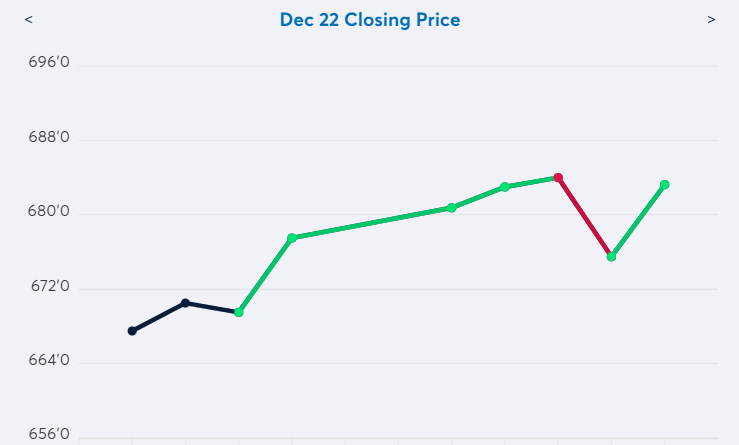
Because the CAS understands the conceptual underpinnings of each visualizer, it can go beyond just showing you the numbers like you’d see in a standard issue dashboard chart. Those charts might show you all the information, but they won’t necessarily make it easy to see why that data is compelling. This is where chart ‘Scribbles’ come into play. ‘Scribbles’ is a catch-all term for human touches that a CAS system can add to a chart to make it easy for the viewer to quickly understand its importance. For example, when a chart is visualizing a metric having moved up in X out of the last Y periods, the chart could highlight the positive movement in green, while showing the negative movement in red. In other situations it might use arrows to point out key data points, or add a trend line to compare movement to.
These additions are not necessary of course, but they help make it that much easier for decisionmakers to easily understand what they need to know. When reporting on data, good writing is all about allowing the reader to spend less effort understanding the report so that the reader can spend more effort thinking about the implications of the report. By holding the viewer's hand as they look at a chart, Scribbles allow a little section of the viewer's brain to relax, freeing up that brainpower to be used for something more valuable.
User Control
The CAS can default to showing the most compelling visuals, but why stop there? After all, the reader is the ultimate judge of what is important, so why not give them the ability to visualize any piece of information within a narrative? That’s exactly what a CAS interactive dashboard is able to do. The CAS can visualize any event within the data, so that allows end users, with the press of a button, to turn any sentence in a narrative into a chart or graph. This not only allows users to quickly visualize information but can also allow them to create charts and graphs to share as a part of a presentation. Alternatively, they can turn a sentence into a table if they want to view the data that the sentence was built from. That allows them to quickly dig into underlying data to understand what sub-components might need more examination.
The Whole Package
Taken collectively, concept-based visuals create a step change in how reports integrate visual information. Instead of pre-set charts and graphs, users see the charts and graphs that highlight the most important information they need to know. Those visualizations are then formatted in such a way that the user can quickly understand the significance of each visual element, whether that might mean highlighting sections of a chart or adding arrows and text. Finally, the user is given the freedom to turn any part of a report into a visual element, whether that be a chart, graph, or table.
The user can even turn any aspect of a report into an automated video…but that will have to be the subject of a blog post sometime in the future 😊