
Ok, first things first- pivot tables most certainly DO WORK…at some things. This article is not about why pivot tables are useless, but rather about the ways that pivot tables fall short of solving the data analysis needs for many companies and use cases. I also explain the fundamental reasons WHY they fall short. I focus on pivot tables because they are probably the best tools that currently exist for most companies to run data analysis. If pivot tables can’t help you with your data analysis, then it’s probably the case that no software tools can (that you know of 😉).
How Pivot Tables Can Help
Pivot tables are great at quickly surfacing the most important top-line numbers in your data. Let’s use, as an example, a retail company that has a record of every single sale they've made. They could store each sale as a row in a spreadsheet, showing the date of the sale, price, location, and a product class.
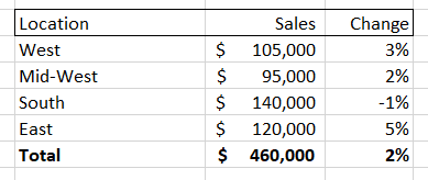
If the company had a large number of sales then the spreadsheet would quickly get unwieldy. Summing up the total sales could be helpful, but what if you wanted to dive into a particular aspect of this sales data? A pivot table gives you that ability, allowing you to, for instance, isolate sales for a given month and then break down those sales by location. It might look something like this:
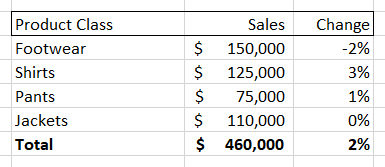
You could also choose to break down the sales numbers by product class, giving you something like this:
Pivot tables also allow you to change time periods, add new columns (like net profit, discount percent, etc.) and also easily turn these tables into charts and graphs. However, while a pivot table allows you to very easily see and visualize numbers, it only allows you to see that information along the dimension of your pivot table. So, if you are looking at the ‘location’ breakdown you can see the changes along that dimension. Same for the ‘product class’ breakdown.
But what if the interesting information that you need is at the intersection of two different dimensions? For example, both the “Midwest” and “Shirts” could individually have the numbers shown above, while sales of “Shirts in the Midwest” are down significantly. You would not be able to see this by looking at either of these pivot tables.
A quick-witted data analyst at this point will point to a flaw in my complaint- if the interesting movements in my example data are located at the intersection of the ‘location’ and ‘product class’ data, then a user could select both of those dimensions to create a new, more detailed pivot table. Something that looks like this:
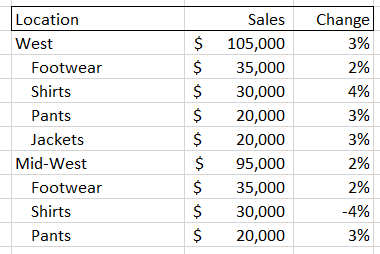
But there are two problems with this solution. First, you have to proactively find the right set of intersections. As we will soon see, the number of possible combinations for most data sets is gigantic, so it may be difficult to find the key information if you don’t have significant time and/or expertise. Second, as you increase the amount of information in your pivot tables it becomes harder to actually digest it. In the examples above, we went from a very easy-to-read set of four items plus a total value, to a much harder to digest set of 16 sub-items, 4 items, and a total value. This could easily get out of control if we added a third dimension, and that’s before adding more metrics or KPIs as columns and/or having larger numbers of sub-components for each dimension.
It's More than Just Subjects
Hopefully you have a sense of how difficult it can be for pivot tables to deal with all the different ways that subjects and groups can be broken down. Unfortunately, that is only one small problem in the world of data analysis. There are five big dimensions to data analysis. Critically, each of these components is independent of each other, meaning that pivot tables, which start to get unwieldy when handling three dimensions of interaction, are utterly hopeless in helping users to understand interesting aspects of their data that might involve seven or more dimensions of interaction. The five main classes of dimensions (which each can contain many sub-dimensions) are:
Subject Groupings
The retail grouping example I used above is really an aspect of two different dimensions of analysis – parent grouping and children grouping. When examining data from a parent group perspective we look to see how it compares to other subjects in the same group (e.g. Midwest vs. East) or compare data to the average among all siblings (e.g. Midwest vs. All Locations). When looking at children groupings, we are looking to see which sub-components are driving the overall figures. As noted in our pivot table example above, this might involve diving into multiple dimensions (e.g. 'location' + 'product class') to determine the most relevant subject.
Timing
There are different ways to create data points using time periods (sales for the day, week, month, etc.). There are also different ways to contextualize data over time periods: we might look at how a metric has changed over time, whether it has trended up or down over a certain time period, or how it compares MTD to a similar period in the past. Both the way we create data and the way we compare it are independent dimensions (e.g. you can look at how data from this month [data creation period] compares to data from the same month last year [data comparison period]).
Metrics
These are the actual figures you care about in your data, such as ‘total dollar sales’, ‘units’, ‘average price’, etc. There is some conceptual similarity between dealing with a group of metrics and dealing with a group of subjects. The key difference is that groups of subjects combine to form their parent (such as the sales for all ‘locations’ adding up to the total sales) whereas metrics are different aspects of the same subject. Pivot tables do a reasonably good job of handling this dimension, as you can typically express different metrics using columns instead of rows. Adding more than a few columns, however, can quickly overwhelm the end user, which is a problem because end users often have a large number of metrics that they potentially care about. The use of metrics is also complicated by the fact that many metrics have different aspects that function like new dimensions of analysis. For instance, you might have a total sales figure, but then there is also the change of that figure over time.
Events
These are the different types of ‘stories’ contained within your data that end users are concerned with. Stories like ‘X metric is trending up’ or ‘Y metric is now above 0 for the first time since Z date.’ Most end users have a list of hundreds of events they care about. Pivot tables typically do not even make an attempt to handle this aspect of analysis, leaving it up to the user to deduce these events from looking at the numbers.
Importance
This dimension tries to break down data by what is actually the most valuable to the end user, which requires it to sit at the intersection of all the above dimensions. It needs to weigh the inherent interest level of a particular subject, each metric of that subject, each possible time period to analyze that metric over, and each event that metric could be involved in. On top of that, this dimension incorporates other elements, such as the volume of a given subject (compared to its sibling metrics) and whether a particular event is relevant given previous reporting.
Just how crazy difficult it is to navigate each of these dimensions while running data analysis is obscured by the brilliant human brain. Humans have the ability to map layers of meaning on top of each other and simultaneously calculate across multiple dimensions of analysis. We can then synthesize the most important information found at the intersection of all the dimensions listed above- either creating a narrative, giving a presentation, or creating a set of key charts and tables. Unfortunately, this process for human beings requires expertise and intuition as they wander down pathways in the data to find those nuggets of information. It also takes a great deal of time, costs a lot of money, and can never be as thorough as a computer. Pivot tables are really just a partial shortcut- allowing data analysts to skip a couple of dimensions of analysis but still requiring them to brute-force the rest.
Time to Pivot from Pivot Tables

What if a computer could handle this task? You would then get the best of both worlds. Like a human being, it could flexibly run through multiple, independent dimensions of analysis and then synthesize its findings in a way that was easy to understand. Being a computer, it could also analyze information much more thoroughly, run its analysis very quickly, and be able to produce reports at incredible scale. infoSentience has actually created technology that can accomplish this. In brief, the key technology breakthrough is to (1) use conceptual automata designed to run an analysis for a particular dimension, (2) allow each automata to run independently, and (3) give them the intelligence to interact with the other conceptual automata so that they can come together to form a narrative. Keep following this space for more information on just how far reaching this breakthrough will be.